
Visualizing mathematics with Nicolas Garcia Belmonte
Understanding mathematical concepts with visualization and programming

Mathematics is visual.
Transforming abstract structures into images is one of the most important thinking tools; even the all-time most read post of The Palindrome is about this very idea.
If you are a frequent reader, you know I put excessive time into the illustrations. Sometimes, drawing the pictures takes more time than writing the text.
For some, mathematical illustrations are not just educational tools but works of art. Nicolas Garcia Belmonte is such a person whose work I first encountered when looking for illustrations for the famous Hopf fibration when I found his interactive app.

That was the very first time I got to play around with an interactive visualization of the Hopf fibration, which instantly blew me away.
From there, I quickly found his library of works, and I was impressed.
His works of mathematical art go beyond software: wood cuttings, pen drawings, and 3D prints.
I truly admire such a high level of skill, dedication, and craft, so I've invited him to talk about his life, work, and inspiration.
Tivadar: Hey, Nico! Glad that you’re here. Let’s jump straight into your artwork: which one is your favorite, and why?
Nico: Probably my favorite project is the interactive visualization of Myriahedral Projections. The original work by Jarke van Wijk, presents a novel method to map the Earth on a plane. Usually, when mapping the globe to a flat plane we have to make tradeoffs between preserving distances or preserving areas, as we need to distort or stretch the material to fit the new surface. The author introduces a third approach to this: we can preserve both distances and areas if we introduce several cuts or interrupts to the map.
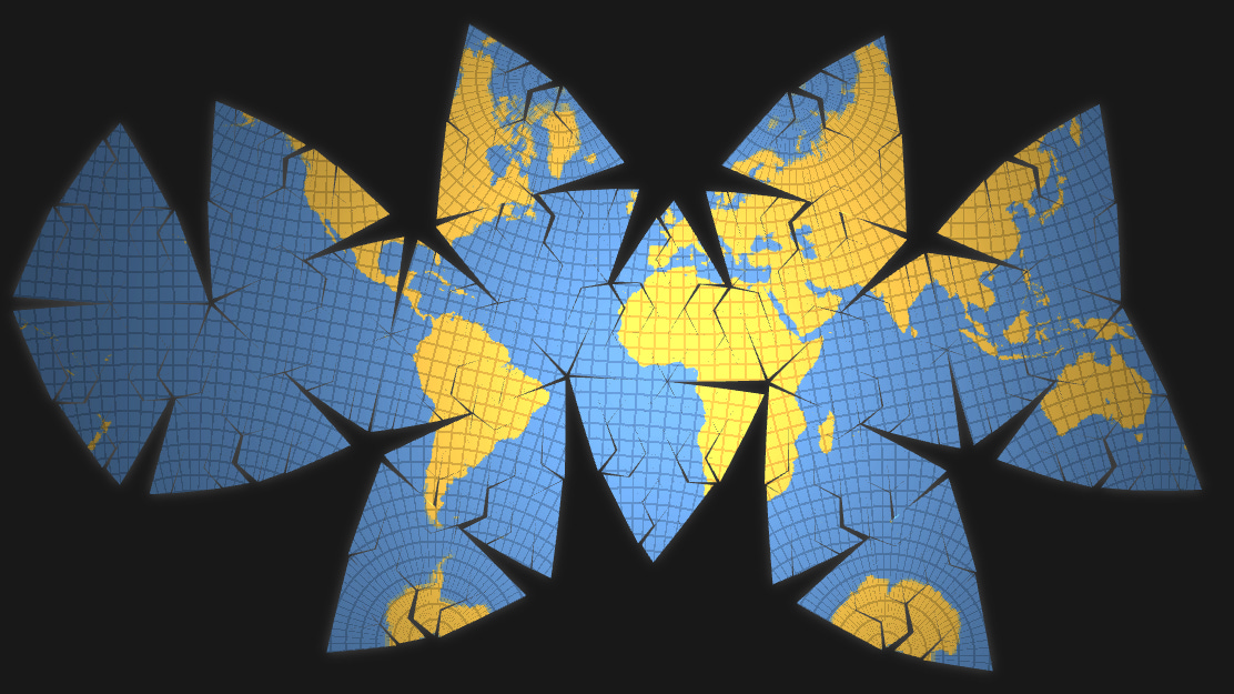
The release of this project marked the 10th anniversary of the paper’s publication, and was an homage to Jarke van Wijk, who has been a big influence in my career. It was also an inflexion point in my practice as I started focusing more on mathematical visualization as opposed to data visualization in general.
How does the project work (talk covering the project here):
We create a Myriahedral Projection by projecting the globe into a data structure the author calls a myriahedron: a polyhedron with a very large number of faces. Next, this polyhedron is cut open and unfolded. When choosing cuts following a graticule, we find familiar map projections. But now we have more freedom and flexibility to choose cuts following other patterns, and this is where interesting things start to happen—as this physical model was used to illustrate traditional projections, but now it can be leveraged to invent new ones.
Tivadar: I’m curious about how you got interested in “Computational Design and Generative / Math Art,” as you put this in your bio. How did you get started?
Nico: I got introduced to data visualization in college (circa 2006), in a visual programming class where hyperbolic tree visualizations were mentioned in passing. I was excited to see we could do this type of visualization work with code, and as I use programming as a way to understand new concepts, I went through the first implementation of a hyperbolic tree in javascript, and eventually to developing a framework for data visualization. InfoVis seemed like the right combination of computer science/graphics, data, and design.
I used data visualization to create exploratory and explanatory visualizations of a variety of things (as part of Twitter: for marketing and public communications, as part of Uber: for geospatial data), but since the release of Myriahedral projections I turned to visualizing math concepts as a way to get deeper into this topic.
Tivadar: What do you do for a living? Is mathematical art a creative hobby, or does it play a role in your work?
Nico: I work as a director of engineering at Meta, on AI experiences. Math art is really a creative hobby. I find Math in general a creative hobby. I usually read math books that end up inspiring side projects and visualizations.
Tivadar: What do you think makes a visualization great? I’m curious about both the data and the math worlds, as it’s so easy to get a visualization wrong. In math, illustrations can solve problems or lead to false conclusions; it’s the same in data science. Where’s the line between simplicity and nuance?
Nico: A visualization usually targets a specific audience and should have a goal. In some cases it allows the end user to explore, slice and dice the data freely. In others it wants to share an insight. Or tell a story. Or even make you feel something.
To get started on effective data visualization I would tend to go to the “Fundamental Principles of Analytical Design” by Edward Tufte. Or to Tamara Munzner’s “Visualization Analysis and Design”.
But for math visualization, things are a bit different. These are usually explanatory visualizations, where interactivity can play a key role as we explore higher dimensions, different kinds of geometries, or the work of actions (symmetries). Much of my inspiration has come from Conway’s “The Symmetries of Things”, Mumford’s “Indra’s Pearls”, Weeks’ “The Shape of Space”, Fathauer’s “Tessellations”, and the list goes on…
Lately though I enjoyed exploring hand-drawn visualizations into the axidraw1. The illustrations in Hilbert’s “Geometry and the Imagination”, Rademacher’s “The Enjoyment of Math” and the Felix Klein’s Protocols are fascinating.
These are all great books that I highly recommend people to explore as they immerse themselves into math and math visualization.
Tivadar: As a creative and introspective person myself, I frequently delve into a deep metacognitive analysis of my processes, and I wonder if you do the same. What’s your process? What draws you into a project, and how do you go from idea to art?
Nico: My process is simple: I use programming to build an understanding of math concepts. As I build these data structures and algorithms, I start exploring the parameter space and produce visuals that can be intriguing. Beyond picking up new concepts in the process, I also push myself to learn new technologies, like WebGPU. A somewhat recent example of this is the set of explanatory visualizations behind the book Indra’s Pearls. Another example has been taking the ideas from the hyperbolization of euclidean ornaments, generating hyperbolic mappings of floor patterns.
Tivadar: What’s your opinion on how generative art evolved into prompting from the mastery of graphics, math, and programming? Do you use AI in your workflow? What do you feel is the ideal balance between human and AI contributions?
Nico: On one end, this approach is orthogonal to my creative process: what I want to get from my creative process is an understanding of the underlying math concepts I am visualizing, and while exploring its parametrization, produce intriguing visuals. Prompting would add a level of abstraction that would make this not possible. On the other hand, prompting introduces a level of unpredictability for the output that seems very appropriate for a creative process, where beautiful things can happen when introducing some level of randomness. Most likely for this to be useful in my process I’d need to train a model with data that I care about with metadata around the math concepts that are related to it, and then prompting it with more sophisticated mathematical information to start creating things in this space. Maybe an idea for my next project!
If you want to check out Nico’s work, check out his
portfolio at https://philogb.github.io/,
Instagram profile @artematician,
and his explanatory pieces at Medium.