
The Anatomy of the Least Squares Method, Part Three
Real-data examples


Hey! It’s Tivadar from The Palindrome.
The legendary Mike X Cohen, PhD is here to continue our deep dive into the least squares method, the bread and butter of data science and machine learning.
Without further ado, I’ll pass the mic to him.
Enjoy!
Cheers,
Tivadar
By the end of this post series, you will be confident about understanding, applying, and interpreting regression models (general linear models) that are solved using the famous least-squares algorithm. Here’s a breakdown of the post series:
Part 1: Theory and math. If you haven’t read this post yet, please do so before reading this one!
Part 2: Explorations in simulations. You learned how to simulate and visualize data and regression results.
Part 3 (this post): real-data examples. There’s no substitute for real data. In this post you’ll import, inspect, clean, and analyze a real-world dataset using the statsmodels, pandas, and seaborn libraries.
Part 4: modeling GPT activations. We’ll dissect OpenAI’s LLM GPT2, the precursor to its state-of-the-art ChatGPT. You’ll learn more about least-squares and also about LLM mechanisms.
Following along with code
I’m a huge fan of learning math through coding. You can learn a lot of math with a bit of code.
That’s why I have Python notebook files that accompany my posts. The essential code bits are pasted directly into this post, but the complete code files, including all the code for visualization and additional explorations, are here on my GitHub.
If you’re more interested in the theory/concepts, then it’s completely fine to ignore the code and just read the post. But if you want a deeper level of understanding and intuition — and the tools to continue exploring and applying the analyses to your own projects — then I strongly encourage following along with the code while reading this post.
Here’s a video where I explain how to get my code from GitHub and follow along using Google Colab. It’s free (you need a Google account, but who doesn’t have one??) and runs in your browser, so you don’t need to install anything.
📌 The Palindrome breaks down advanced math and machine learning concepts with visuals that make everything click.
Join the premium tier to get access to the upcoming live courses on Neural Networks from Scratch and Mathematics of Machine Learning.
Real vs. simulated data
In the previous post, I explained the benefits of learning machine learning by simulating data. And now here I will explain the benefits of using real data 🙂
Real data have quirks, idiosyncrasies, non-mathematically-defined distributions, missing data, outliers, and other annoyances that are difficult to simulate. These “annoyances” are… well, annoying, but they are the reality of working with data. Think of the difference between learning how to drive a car using a video game simulator vs. learning to drive in the real world.
Real data can actually teach you things about how the world works. Simulating data can help you learn about algorithms, but you cannot learn about the real world from simulated data.
Real data often contain multiple complex and subtle patterns that are missing from simulated data. This means that creativity, critical thinking, and data-mining skills can help you make new discoveries in real datasets. Simulated data can only contain the patterns that you code into it.
The arguments for and against simulated data are not contradictions: real data and simulated data have complementary benefits, and you can supercharge your learning by using both.
The Residential Building dataset
We will analyze a public dataset on predicting real-estate prices. Here’s a screenshot of the publication from which the data are taken:

The data are hosted on the UCI machine learning data repository. If you’re unfamiliar with the UCI-ML repo, it’s an excellent resource for finding datasets to download for free and without registration. The dataset url and full citation are printed in the online code, which is linked at the top of this post.
The dataset is about the sale prices of residential apartments in Tehran. There are many features in this dataset; I selected four to focus on: sale price, apartment size measured as floor area, the interest rate for mortgages at the time, and the CPI (consumer price index, a measure of the average change in consumer prices for typical goods and services).
Import and visualize the data
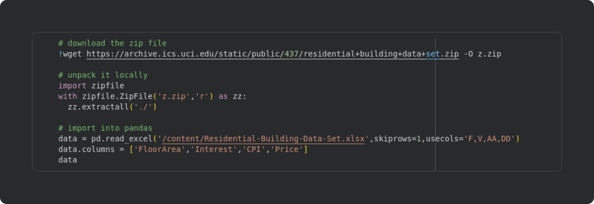
The dataset on the UCI website is a zip file that contains an Excel (xslx-format) file, so importing the data is a little more involved that reading a text file directly from the web.
The code block below downloads the zip file, unpacks it on the Google colab server (that is, if you’re running the code on colab, you don’t need to download the file onto your local computer), unpacks the zip, and imports the data into a pandas dataframe.
I then used the pairplot function in the Seaborn library to visualize the histograms and scatter plots of all four variables. Take a moment to inspect the figure below and make some observations, before reading my observations below the figure.

About the histograms on the diagonals:
FloorAreaandPricehave log-normal distributions (all positive values with a strong tail to the right). This can be problematic for regression analyses, because the analysis assumes that data are drawn from a normal distribution. The small number of extreme values can cause over-estimation biases of the betas. I’ll get back to this point in the next section.Interest rate has only four unique values, most of which are in one category (15%). Again, a very non-Gaussian distribution that I’ll fix in the next section.
The scatter plots show various patterns of linear and nonlinear relationships. Several scatter plots show heteroscedasticity, which is a fancy statistics term for changes in variance with changes in values. For example, notice that the spread on the y-axis increases as
CPIincreases in the scatter plot ofCPI-vs-Price.
Transform and clean the data
Data that have all positive values and a long rightward tail can be transformed into a more-normal distribution using a logarithm transformation. I’ll apply that to the FloorArea and Price variables. The CPI distribution doesn’t look like a perfect Gaussian, but it also doesn’t have an extreme right tail, so I’ll leave it unchanged.
The interest rate variable is another story. There is no point in applying a log transform, because there’s just too little variability for the transform to do anything useful. So instead, I’ll binarize the data (transform it to have only one of two possible values). When binarizing data, it’s ideal to have two groups with roughly equal counts. Looking at the distribution, I’ll label 15% “high interest” and all the other values “low interest.” (Of course, “high” and “low” are relative terms; many people would consider 11% interest on a mortgage to be quite high…)
Here’s the code and a snippet of the new dataframe:
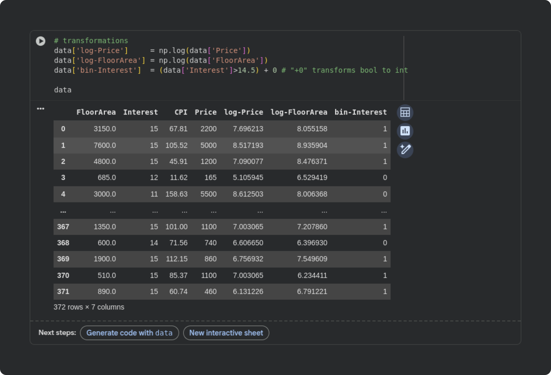
Notice that I put the transformed variables into new columns in the dataframe, as opposed to overwriting the original variables.
The figure below shows the results in another pairplot (I’ve omitted the binarized interest rate). The distributions look much more Gaussian, and the scatter plots from the transformed data look more homoscedastic (equal variance across the range of values).

The clearest relationship in the data is that between CPI and log-Price; I am not an economist but this relationship makes sense to me: CPI is a measure of the cost of things that people buy, and an apartment is a thing that people buy.
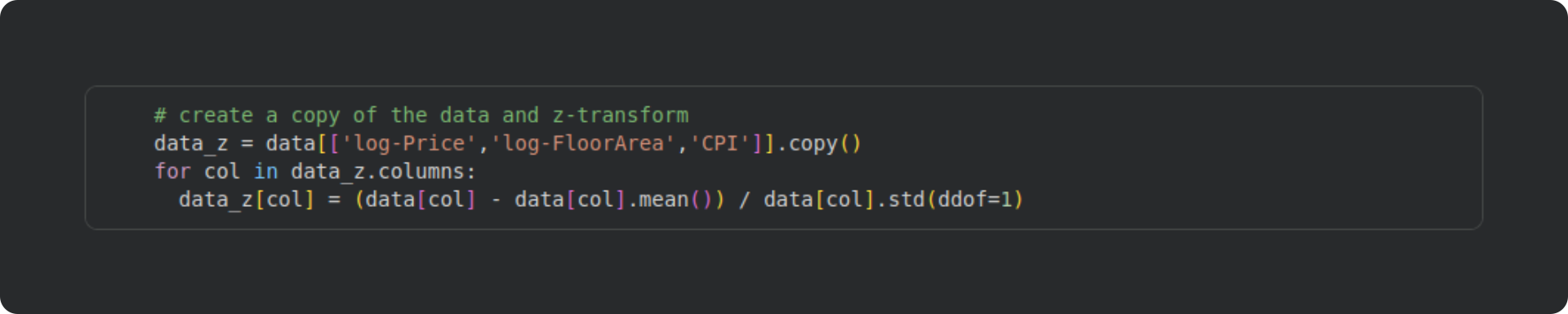
The next issue to deal with is outliers. Outliers are extreme data values that can bias results of machine learning analyses. A common strategy to identify outliers is to z-transform the data and label data values as outliers if they exceed a threshold. A z-scored variable has a mean of zero and standard deviation of one, which puts every variable in the same scale with units of standard deviation. Here’s the formula for the z-score transform:

xi is the i-th data value, the x with the bar on top is the average of the variable, and the σ(x) refers to the standard deviation of the variable.
The code block below creates a new dataframe and transforms the variables into z-scores. You could alternatively add new columns into the existing dataframe as I did with the log-transform. Just be careful with overwriting the original data — that can be the right thing to do in some cases, but it also risks headaches, misinterpretations, and errors. In this dataset, I want to analyze the original data, not its standardized transform, and so I won’t overwrite the original data.
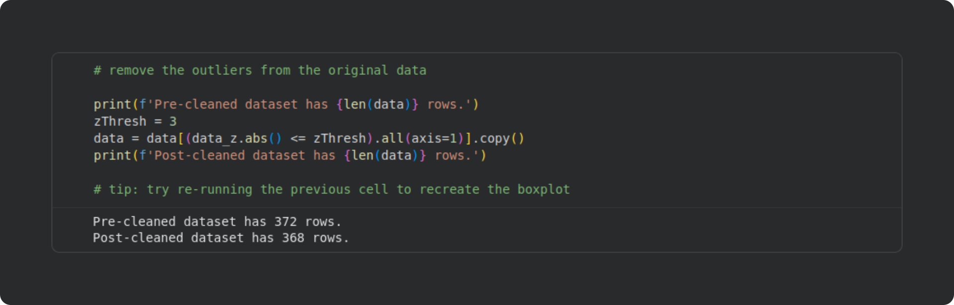
Once we have the z-scored variables, we can use a box plot to check for the presence of outliers. A box plot shows the distribution of the data, with the “box” showing the inner 75% of the data values and the horizontal lines showing the non-extreme values.

The red horizontal dashed lines correspond to a z-score of 3, which is a common cutoff for identifying outliers in real data. Based on this criterion, there are four outliers in total: one in log-Price and three in log-FloorArea. I applied row-wise removal, which means that the dataset went from containing 372 rows to 368 rows.
Now we have a clean dataset, and we’re ready to run a regression analysis using least-squares!
The goal will be to predict the sale price based on the interest rate, CPI, and floor area.
Run the analysis (and an explanation of “interaction terms”)
Before running the analysis, I need to tell you about interaction terms. An interaction in a regression is when the effect of one variable depends on another variable. For example, imagine a study on the effects of diet and age on weight loss; a finding that diet leads to weight loss in younger but not older people would be an interaction between age and diet (that is, the effect of diet interacts with the effect of age).
In our apartment-sales dataset, I will create an interaction term combining the interest rate and CPI. My thinking is that when banks charge higher interest for a mortgage, sale prices will be higher especially when CPI is also high (high CPI indicates inflation, because the cost of living is increasing).
How do we create interaction terms? We literally just multiply the two variables to create a new variable. In this example dataset, I’ve binarized the interest rate, so the interaction term is actually all zeros for the low-interest rate data rows, and the CPI itself for the high-interest-rate data rows.
And now for the code, with explanations beneath:

I created an intercept term as a column in the dataframe of all 1’s. It is also possible to have the
statsmodelslibrary include an intercept term; I’ll show you how to do that in Post 4.This is the interaction term. You can see that the interaction is literally the element-wise product of two (or more) variables. In some models, interpreting the intercept may be challenging, but there is nothing mathematically different between a normal regressor and the product of two other regressors.
Here’s where I fit the model. In the first line, I create a new dataframe that contains only the variables in the design matrix (dropping all the non-design-matrix columns). And then in the second line I call the
statsmodels.OLSfunction (OLS = ordinary least squares), inputting the dependent variable (log-Price) and the design matrix.
Notice in the final line of the code block that I’ve applied the .fit() method to the sm.OLS output. In this example, we don’t need the non-fitted model object.
Remember from the first Post in this series that least-squares is a one-shot algorithm. There are no complicated nonlinear iterative methods or artificial neural networks to train; it’s just some linear algebra with some small computational adjustments to improve numerical stability. That means that the code is fast to run, literally a few thousandths of a second.
The fitted variable model contains a lot of information about the model fit. Calling model.summary prints out all the important information, which I’ll explain below.
Interpreting the sm.OLS model summary
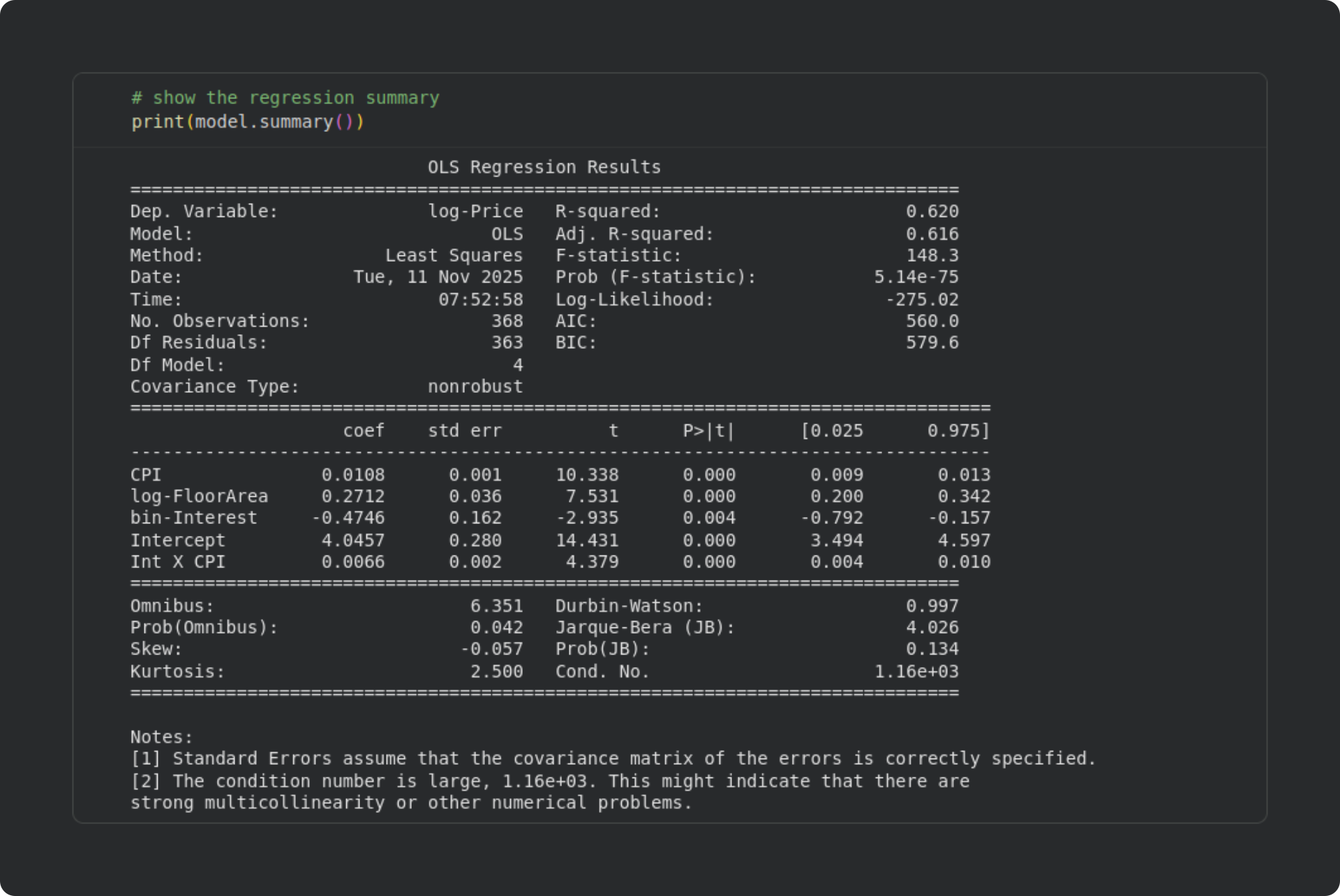
There is a ton of information provided in the output table. Some of the information doesn’t need explaining (e.g., Dep. Variable is the name of the dependent variable). Other information is used for advanced model-fitting and model-comparisons, and isn’t relevant for our use-case here. Below I will describe some of the metrics that statsmodels outputs. I’ll break this down by the three sub-tables separated by rows of equals signs.
Top subtable (overall model information)
This provides basic information about the model, including the model type (OLS, Least Squares), degrees of freedom, R2 and F-statistics, and so on. AIC and BIC stand for Akaike Information Criterion and Bayes Information Criterion. These are used for comparing nested models and polynomial regression models, which are advanced topics in regression that I won’t discuss here.
You can see that the R2 and adjusted R2 are quite close. That indicates that our model did not overfit the data, as I discussed in the previous post.
Middle subtable (individual regressor statistical significances)
This table contains the inferential statistical tests of individual regressors. Each row corresponds to a regressor. coef is the value of the 𝜷 coefficient, std err is the standard error (SE(𝜷); you can confirm that t = 𝜷/SE(𝜷)), the corresponding t and p-values are provided, and the [0.025 and 0.975] columns list the bounds of the 95% confidence interval around the 𝜷 parameter. (Check this post for a deep dive into calculating and interpreting analytic and computational confidence intervals.)
In our analysis, all the individual regressors are statistically significant. They have different scales — and several of the variables are transformed — so the most straightforward interpretation is to look at the sign of the 𝜷 coefficient. For example, a positive impact of CPI means that when the CPI is higher, apartment sale prices are higher. That was clearly visible in the scatter plots, and is consistent with intuition (when the cost of living is high, real estate is more expensive). The negative 𝜷 for interest rate is also sensible: when the interest rate is high, fewer people buy apartments, which reduces their prices; and when the interest rate is low, buying is more attractive, so sellers can increase their sale price.
The intercept term is necessary in regression models, but is usually not interpreted: A statistically significant intercept simply means that the price of an apartment is significantly greater than zero (or one, for log-transformed data) when all the independent variables are zero. That interpretation defies real-world sensibility: What should be the price of an apartment with a floor area of zero? This illustrates that intercepts are required in models to allow a best-fit calculation, but are usually not interpreted.
Bottom subtable (diagnostic tests)
This section provides a list of diagnostic statistics about the data and the model. Omnibus and its associated Prob value is the result of an omnibus test on the residuals to evaluate their normality. p > .05 is a good thing, because it suggests that the residuals are normally distributed. The Durbin-Watson test evaluates autocorrelations in the residuals. The value ranges from 0 to 4, with a value of 2 indicating no autocorrelation. Values less than 1 or greater than 3 suggest the presence of autocorrelations in the residuals, which could be problematic for the model estimation. Skew and Kurtosis refer to the data distribution characteristics (the skew and kurtosis of a Gaussian are 0 and 3). The Jarque-Bera test evaluates these metrics together, and p > .05 suggests that the data were drawn from a normal distribution. Cond. No. is the condition number of the design matrix. The condition number reflects the sensitivity of the model to small perturbations. Imagine, for example, that the 𝜷 coefficients fluctuated wildly if you added one more data observation, or if there were a bit of noise in the measurements; such a model is highly sensitive to small changes in the design matrix, and provides untrustworthy results. There are no specific cut-offs for a “good” condition number, but large values can indicate the presence of multicollinearity. Smaller is better, and the smallest possible condition number is 1.
Visualizing the results
The last part of this post is to plot the results. The figure below is very similar to plots you saw in Post 2. In panels 1-3, the red “x”s correspond to the low interest rate data samples, and the blue circles correspond to the high-interest rate data samples. Splitting the visualization according to a binarized variable is similar to how I median-split the data for visualization in the previous post.
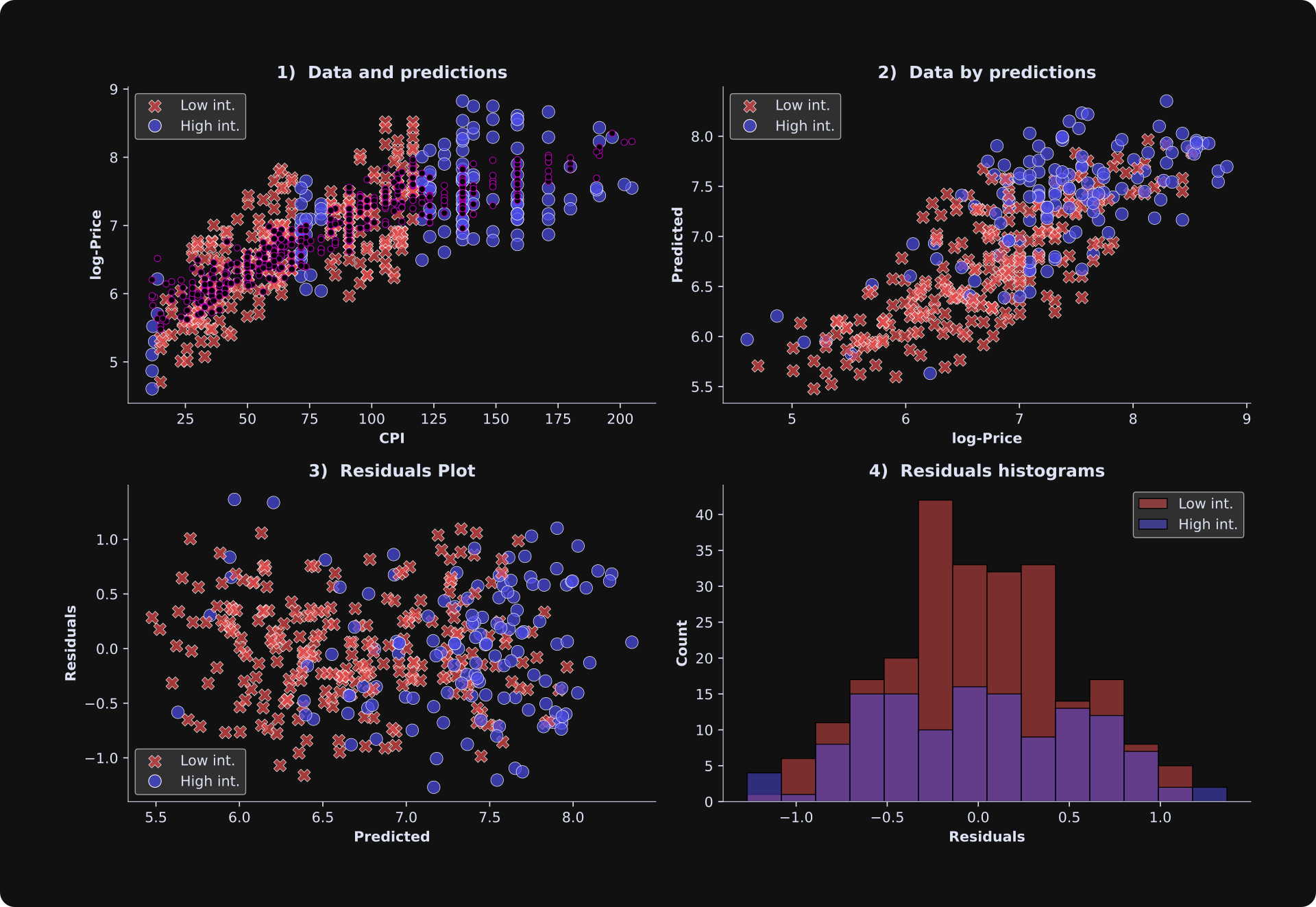
Overall, these results look good: The predicted and observed data are reasonably strongly correlated, and the relationship appears fairly linear. A nonlinear relationship between observed data and model-predicted data would mean that the model fits part of the data well while poorly fitting other parts of the data. The residuals plot does not show any obvious heterogeneity patterns, and the residuals histograms look roughly Gaussian. The predictions in panel A (smaller purple dots) do not form a straight line, but the design matrix is 4D while the plot is 2D, which means that the predicted values are projected down into a lower-dimensional space.
Other Python libraries for regression
There are several Python libraries that provide functions for implementing regressions. You saw in the previous posts that you can implement the basic least-squares equation using numpy, although it would be a lot of additional work to code the rest of the output provided by sm.OLS. Another option is the LinearRegression method in the scikit-learn library. This method is optimized for prediction accuracy in machine learning tasks, and does not provide as many additional checks and diagnostics as sm.OLS does. Regression models can be implemented in TensorFlow and PyTorch, although those libraries are optimized for nonlinear iterative modeling (e.g., deep neural networks powered by gradient descent). But if your goal is to obtain detailed statistical and diagnostic information about a regression analysis, then sm.OLS is the best approach.
Are you excited for the grand finale?
I hope you found this post interesting and helpful.
Post 4 in this series will be really interesting: you’ll learn how to import OpenAI’s GPT2 LLM (the precursor to GPT5), peer inside its internal hidden activations, and use least-squares to test whether the processing of previous tokens impacts the processing of the current token.
And who knows — maybe Hungarian punk music might even make a reappearance...
If you want to keep learning from me, please subscribe to my Substack, and check out my online video-based courses and my books.
 | A guest post by
|