
The Anatomy of the Least Squares Method, Part Two
Explorations in Simulations


Hey! It’s Tivadar from The Palindrome.
Mike X Cohen, PhD is here to continue our deep dive into the least squares method, the bread and butter of data science and machine learning.
Without further ado, I’ll pass the mic to him.
Enjoy!
Cheers,
Tivadar
By the end of this post series, you will be confident about understanding, applying, and interpreting regression models (general linear models) that are solved using the famous least-squares algorithm. Here’s a breakdown of the post series:
Post 1 (the previous post): Theory and math. If you haven’t read this post yet, please do so before reading this one!
Post 2 (this post): Explorations in simulations. You’ll learn how to simulate data to supercharge your intuition for least-squares, how to visualize the results, and how to run experiments. You’ll also learn about residuals and overfitting.
Post 3: real-data examples. Simulated data are great because you have full control over the data characteristics and noise, but there’s no substitute for real data. And that’s what you’ll experience in this post. I’ll also teach you how to use the Python statsmodels library.
Post 4: modeling GPT activations. This post will be fun and fascinating. We’ll dissect OpenAI’s LLM GPT2, the precursor to its state-of-the-art ChatGPT. You’ll learn more about least-squares and also about LLM mechanisms.
Following along with code
I’m a huge fan of learning math through coding. You can learn a lot of math with a bit of code.
That’s why I have Python notebook files that accompany my posts. The essential code bits are pasted directly into this post, but the complete code files, including all the code for visualization and additional explorations, are here on my GitHub.
If you’re more interested in the theory/concepts, then it’s completely fine to ignore the code and just read the post. But if you want a deeper level of understanding and intuition — and the tools to continue exploring and applying the analyses to your own projects — then I strongly encourage following along with the code while reading this post.
Here’s a video where I explain how to get my code from GitHub and follow along using Google Colab. It’s free (you need a Google account, but who doesn’t have one??) and runs in your browser, so you don’t need to install anything.
Why you should use simulated data when learning machine-learning
Here’s why I love teaching data science using simulated data:
Finding, formatting, and processing data can be tedious and time-consuming. Imagine spending 3 hours to find a barely usable dataset when you could simulate the exact data you want in minutes.
Simulated data gives ground truth. With real data, you run an analysis and get something, but you have no way of knowing whether that result is real, a quirk in the dataset, or a bug in your code.
Simulated data gives you full control over effect sizes and noise. Knowing how robust your analysis code is to small effects, noise, and outliers puts you in the top 1% of expert machine learning engineers. That intuition comes from working with 100s of datasets over many years. Running experiments with simulated data helps you speed up that skill development like a racehorse on Red Bull.
Simulating data requires understanding the models and equations, and it helps you refine your thinking about what the models mean and how to interpret them. You’ll understand machine learning better by making up data.
All that said, working with simulated data comes with several limitations, the main one being that it’s really difficult to reproduce the characteristics (and annoyances!) that are common in real data. In the next post, I will outline all the reasons to learn machine learning using real data instead of simulated data, and the next two posts will focus on real data.
IMHO, the best way to master machine learning is to know how to use both simulated and real data.
Creating infinite data
Simulating data to learn about least-squares fitting is straightforward: Start with the model equation, specify values for the 𝛽 coefficients and IVs, choose simulation parameters such as sample size and amount of noise, and then implement that model equation in code.
After you’ve created your simulated dataset, you then apply a machine-learning analysis and check whether the estimated beta coefficients match the ground-truth parameters.
I’ll introduce the data simulation procedure with a simple example, and then build it up to more complicated models later in this post. This first example will continue with the “very serious scientific research” from the previous post: Going to more Hungarian punk rock concerts makes you happier (gentle reminder that the data are fake, but the conclusions might be real 😂).
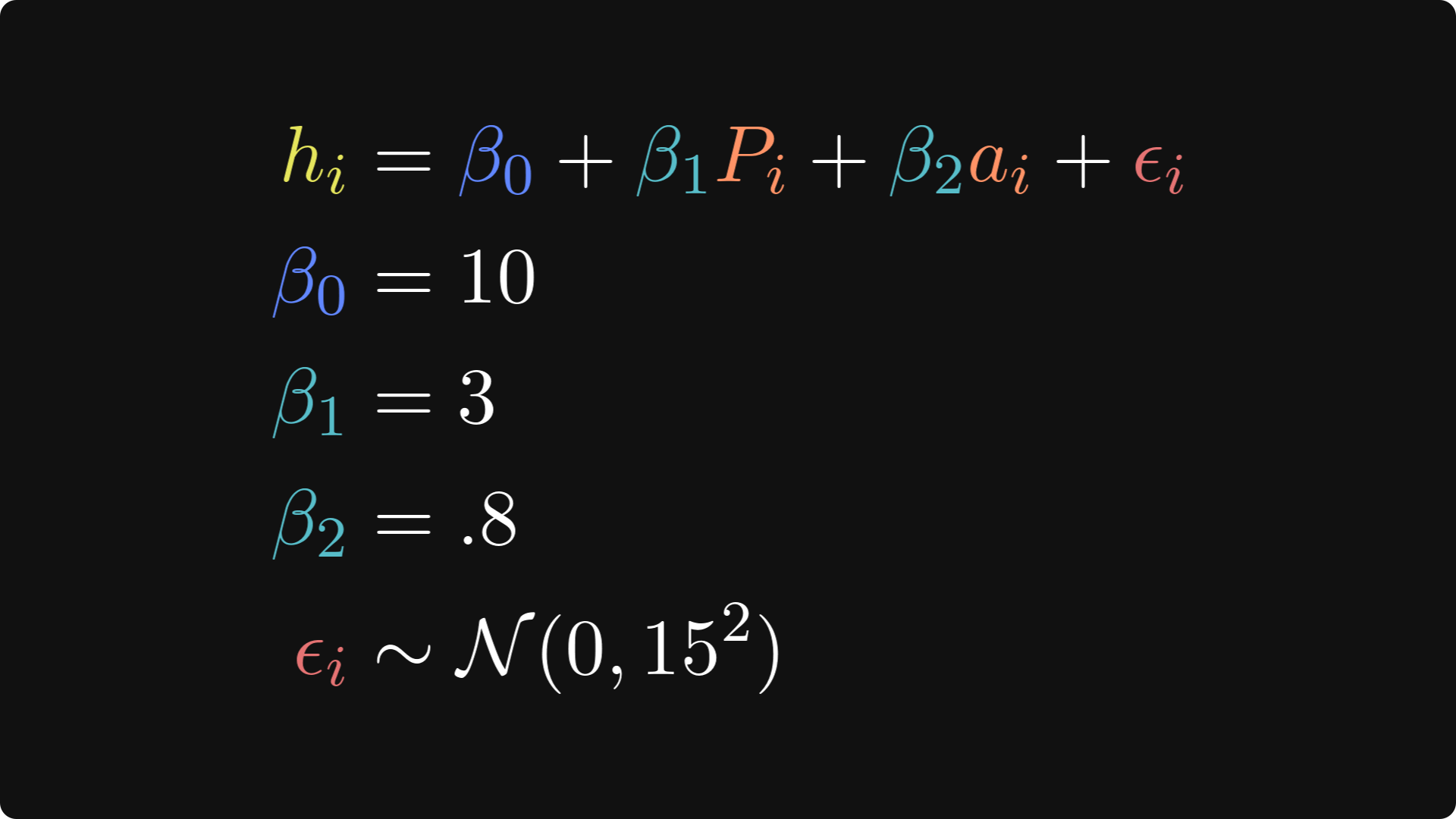
I’ll start with the ground-truth relationship between punk shows and life happiness, which is mathematically expressed like this:
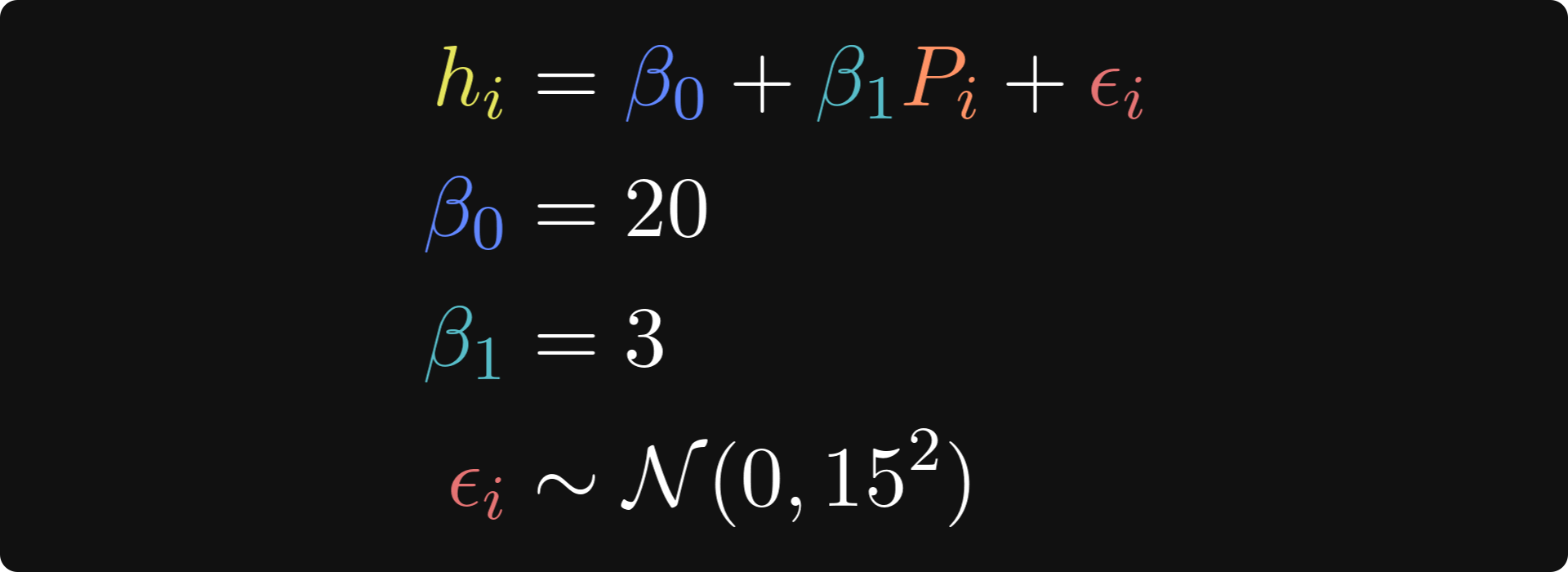
In these equations, hi is the life happiness of person i, 𝛽0 is the intercept, which is the level of life happiness for someone who has been to zero punk shows, 𝛽1 is the regression coefficient that describes the change in happiness for each addition punk show attended, Pi is the number of punk shows that person i has been to, and 𝜖 is a residual — it’s the individual variability in happiness ratings that the model does not explain (even Tivadar would agree that there is more to being happy than just listening to Hungarian punk!).
The three lines after the main equation are how I set the parameters. N(0,152) is the math notation for normally distributed random numbers with a mean of zero and a standard deviation of 15. (The notation formally describes the variance, which is the standard deviation squared.)
The code block below translates the equations above into Python code. Try to understand how each line of code below maps onto the equations above, before reading my explanations underneath.
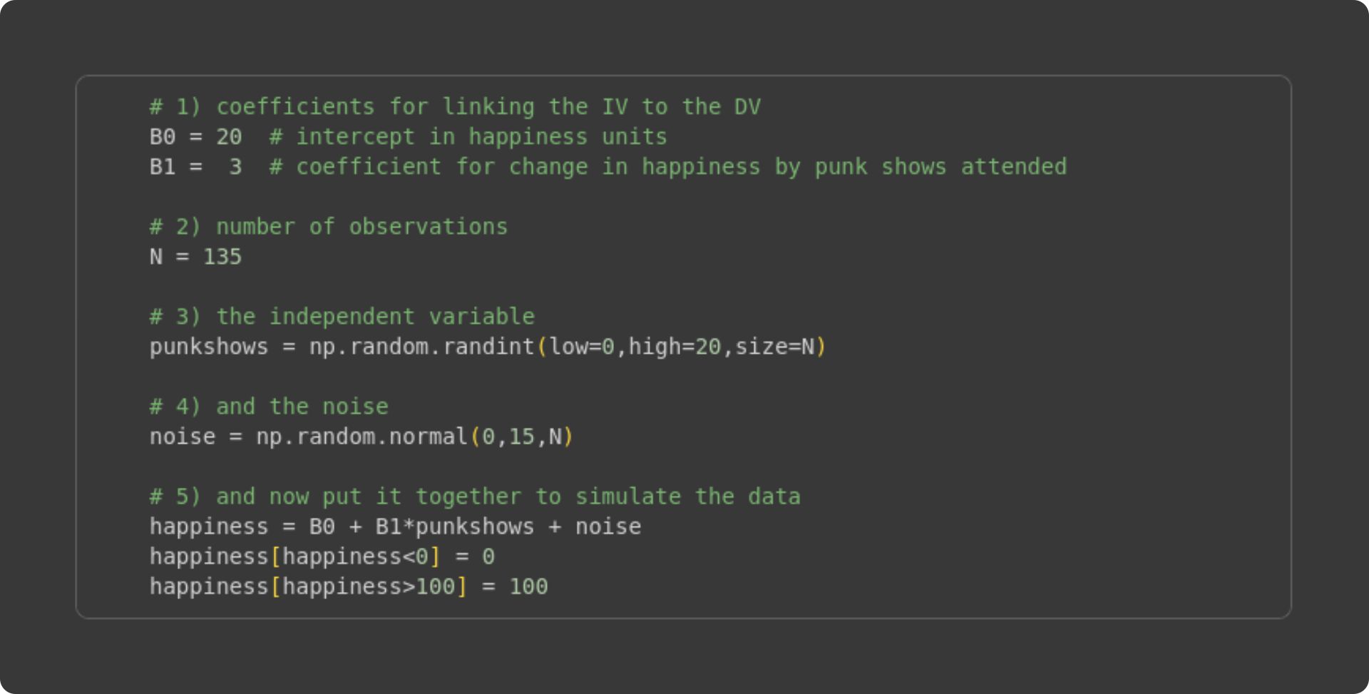
Here I set values for the beta terms. I chose these values somewhat arbitrarily, after a few iterations of looking at the resulting data distributions.
The sample size. One amazing part of simulating data is that you can manipulate the sample size to see the impact on the accuracy of the least-squares fit compared to the known ground-truth values I specified in #1. In fact, I’ll show you how to run systematic experiments manipulating the sample size later in this post.
Here’s where I generate the independent variable. It needs to be integers because we assume that the number of punk shows experienced is a non-negative whole number. The lower and upper bounds are arbitrary (again, I set those values based on looking at the graph of the data), but the sample size is set based on #2.
Simulating “noise,” which would correspond to individual variability in happiness ratings that is unrelated to the independent variable (punk shows).
Here is the key line that generates the data: It is a direct translation of the math equation into code. Notice what I do in the final two code lines: I clipped negative happiness values to zero, and >100 values to 100. “Clipping” is a common data cleaning step in many machine-learning applications, including training deep learning models (e.g., gradient clipping).
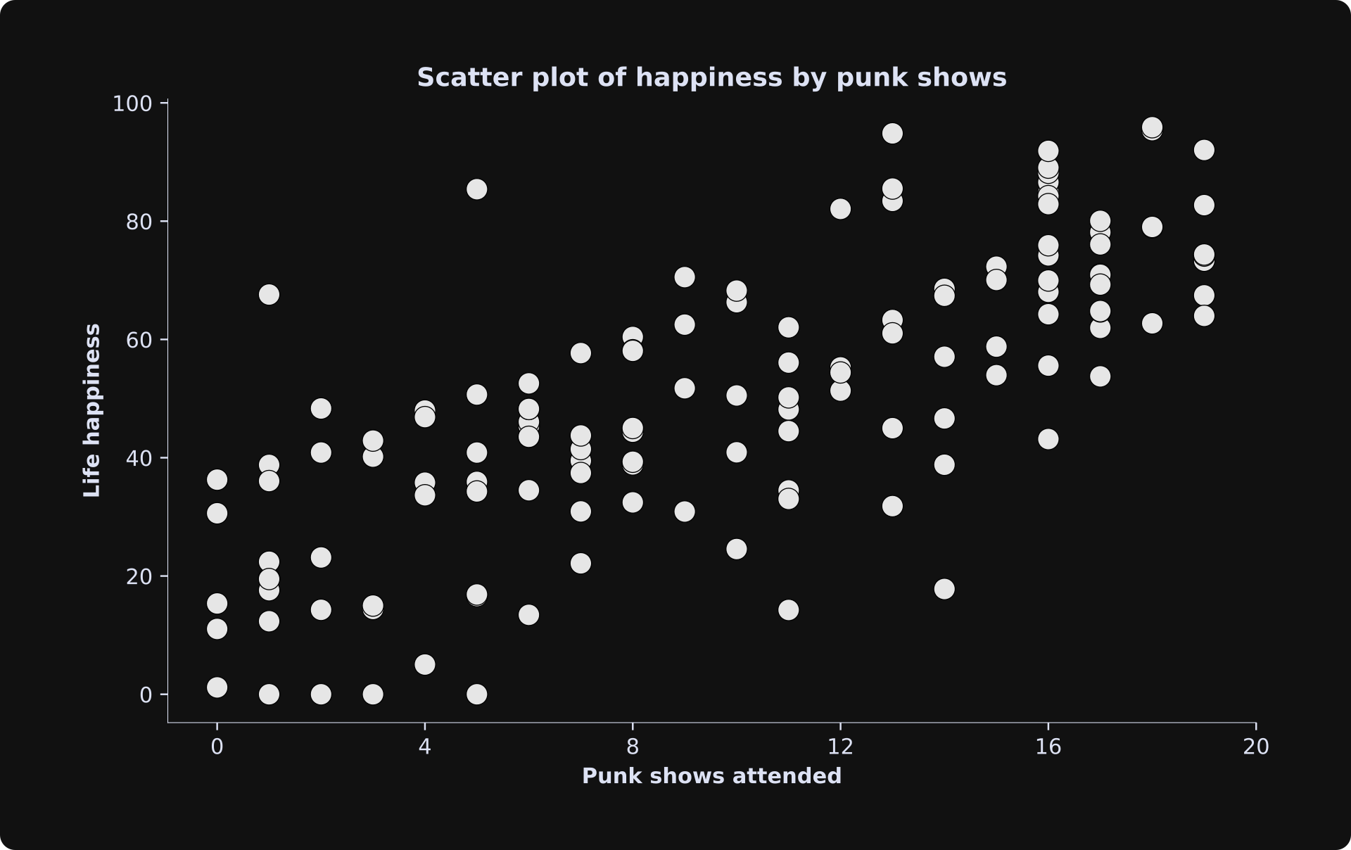
Here’s how the data look:
Before continuing, a word about ethics and data simulations: Making up data is a fantastic way to learn machine learning and statistics. Telling other people that the data are real is unethical and one of the quickest ways to get fired or kicked out of school. Please please please always make sure to document when you are using simulated data, and don’t allow any possibility of someone misunderstanding or thinking that your fake data are real.
Anyway, the next step is to analyze the simulated data as if they were real data, and see how the estimated beta coefficients compare to the ground-truth beta coefficients. Try to understand the code block below before reading my explanations.
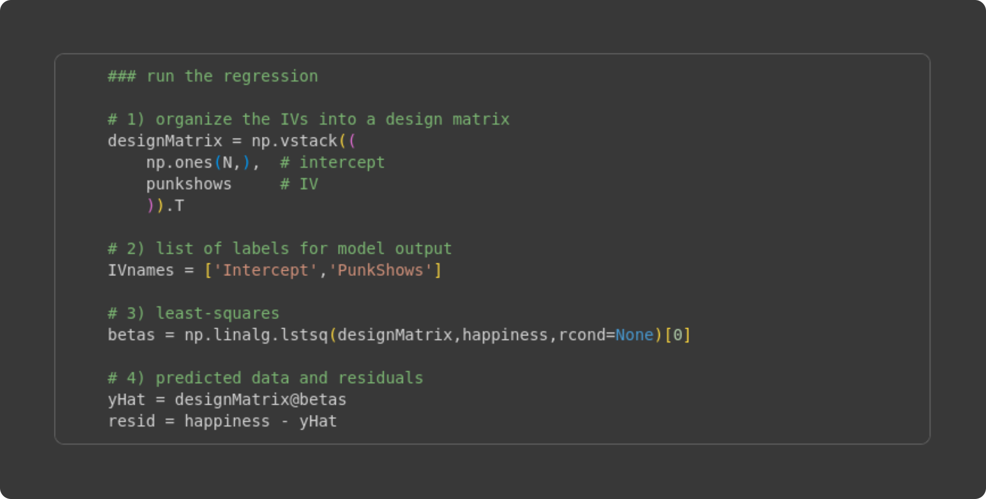
Create the design matrix. It is the vertical stacking of a vector of 1’s and the number of punk shows attended. The resulting numpy array designMatrix is of size 135 × 2.
A list of names of the IVs. This is just for printing the results.
Here’s the least-squares implementation. In the previous Post, I directly translated the math into Python code (e.g., using np.linalg.inv). That approach is great for seeing the link between math and code, but the matrix inverse is prone to numerical inaccuracies and precision errors. The numpy function lstsq arrives at the same result, but using more numerically stable algorithms such as QR decomposition and Gaussian elimination.
Here, I calculate the predicted data as the design matrix times the betas (X𝛽), and the residuals as the difference between the observed data and the predicted data.
Because we know the ground-truth values, we can compare the estimated betas with the real betas:
           | Sim. | beta
-----------+------+------
 Intercept |  20  | 19.68
 PunkShows |   3  |  2.89
The estimated beta coefficients don’t perfectly match the ground-truth values, but they’re pretty close. If you’re following along with the code (which I super-duper a lot recommend!), then you can try running the simulation and analysis code multiple times; you’ll see that the estimated beta values are sometimes a bit closer and sometimes a bit further from the ground truth values. You can also try changing the sample size, e.g., N =20 will give much more variable results, whereas N = 5000 will give results much closer to the ground-truth values.
Visualizing the model predictions and the residuals
All the best data scientists agree that data visualization is very important and very insightful. As an aspiring world-class machine-learning expert, I’m sure you agree as well.
There are many ways to visualize the results of a least-squares analysis. The figure below shows four plots; beneath the figure, I’ll describe what each one shows and what to look for.
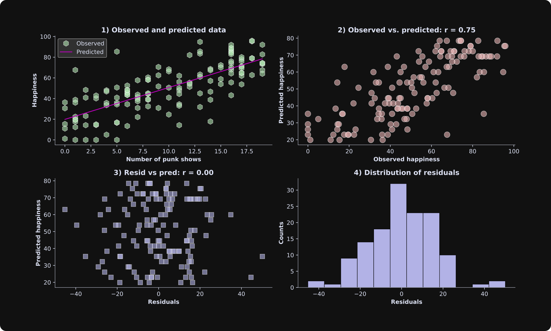
Scatter plot of the data and the best-fit line. This is a great and simple way to visualize observed and predicted data.
The observed data are on the x-axis, and the predicted data are on the y-axis. If the model predicts the data perfectly, the dots would all be exactly on a line. The fit isn’t perfect — in this case, it’s because I added random numbers to the data, and in a real dataset, it’s because the statistical model doesn’t explain all of the variability in the data. Remember that the goal of statistical modeling is to capture the key essence of the data, not to overfit every tiny variation.
WARNING: The correlation between the observed and predicted data shown in the title is informative but is not a suitable measure of goodness-of-fit. I’ll explain why in the next section.The residuals (model estimation errors) are on the x-axis, and the predicted data (life happiness in our example here) are on the y-axis. The correlation between the predicted data and the residuals is zero. That’s no quirk of our simulated example: The correlation between the predicted data and the residuals is always exactly zero. That’s because the best-fit line minimizes the orthogonal projection of the data onto the model fit (a mathematical result of the linear algebra of least-squares). But the point is that you want to inspect this plot for the shape of the scatter plot. It should look like an amorphous cloud, not a funnel or a teardrop. In other words, the math of least-squares forces no linear relationship between the residuals and the predicted data, but you need to check that there is no nonlinear relationship. A nonlinear relationship is a sign of a poor model fit.
The histogram of the residuals should look Gaussian (a.k.a. a normal distribution, a.k.a. a bell curve). In small datasets, it won’t look exactly like a bell curve, but a histogram that has multiple peaks or is strongly lop-sided indicates a poor model fit to the data.
Evaluating model fit with adjusted R2
Conceptually, the idea of R2 (pronounced “are-squared” and also written as R2 or R^2) is to compare the residuals from the fitted model against the residuals from a “baseline model” in which each data point is modeled as the average value. That’s the first equation below. Let’s think about it for a minute: If the model predictions (the yi with the caret on top in the numerator) are very close to the actual data observations (yi), then the numerator of that fraction will be close to zero, which means the fraction will be close to zero, which means R2 will be close to 1. On the other hand, if the model is a poor fit to the data, the numerator will be larger and R2 will be closer to zero. By the way, the formula for R2 is equivalent to a correlation coefficient between the predicted and actual data. I’ll demonstrate that in the code.
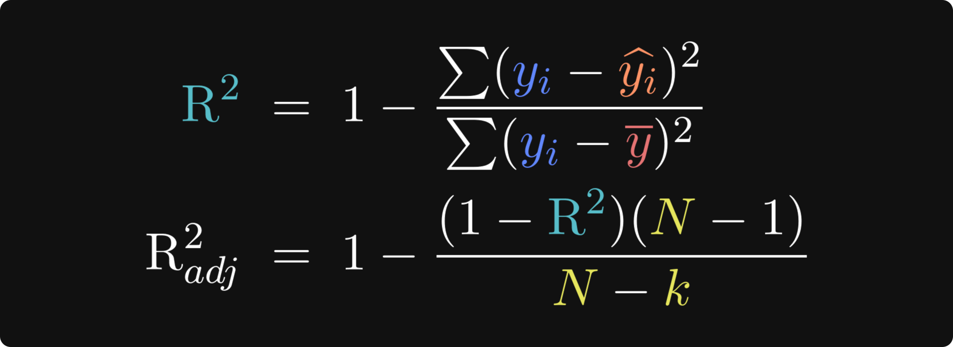
You can probably already imagine that there are some limitations of R2 — otherwise I wouldn’t have written the adjustment beneath it ;)
The problem with the “unadjusted” R2 is that it is sensitive to overfitting. Even adding unrelated regressors — literally just putting random numbers into additional columns in the design matrix — will increase R2. That’s a problem.
Fortunately, the solution to that problem is simple: Use the adjusted R2! The key update is to scale the R2 by the number of parameters in the model — the number of 𝜷 coefficients (including the intercept term). k is the number of model parameters, and N is the total number of observations. N-k is called the degrees of freedom, and N - 1 in the numerator is the degrees of freedom of the baseline model, where every observation is assumed to equal the mean (same as the denominator in R2).
If you think about the adjustment factor as (N - 1)/(N - k), then putting more parameters into the model scales that adjustment factor above 1, which inflates the fractional term, thereby shrinking the adjusted R2. In other words, including more useless regressors decreases the adjusted R2, so you should only add more regressors if the improvement in the fit to the data overpowers the adjustment factor.
Let’s see how the math looks in code.
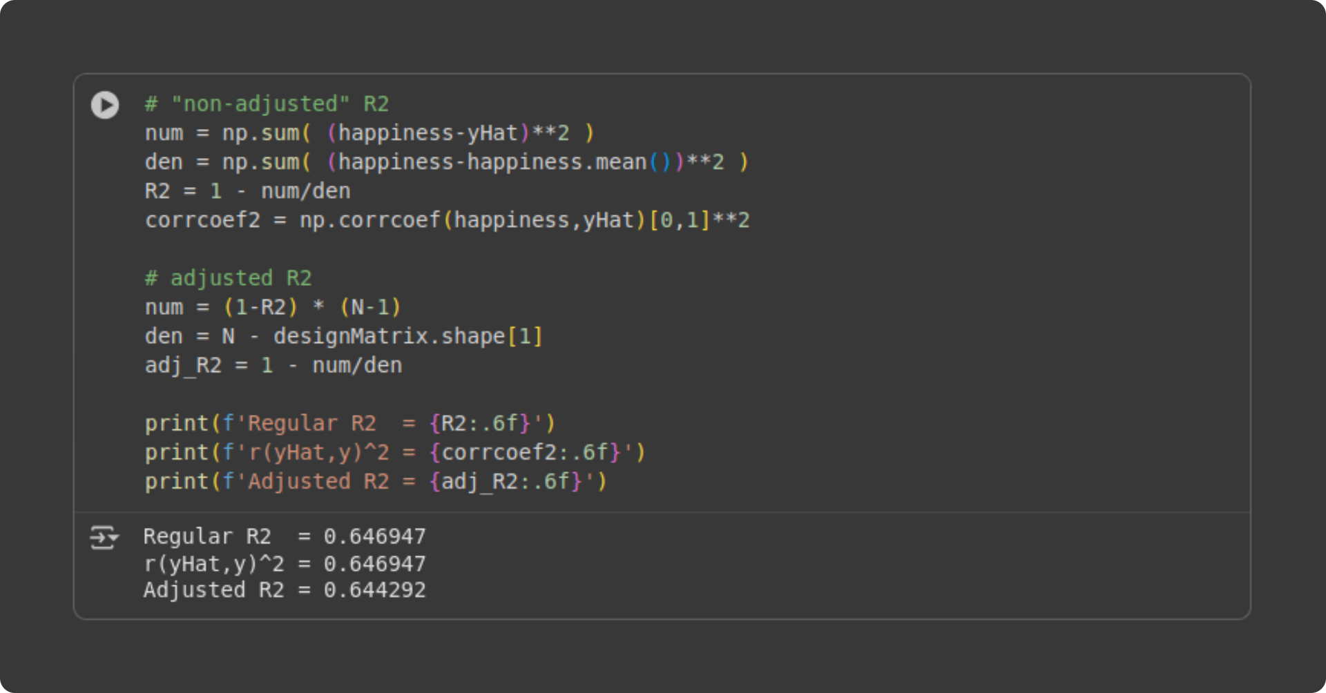
Two remarks: (1) The R2 and squared correlation coefficient are identical. (2) The adjusted R2 is only a tiny bit smaller than the R2. That’s not surprising for a simple regression with two parameters (intercept and slope). Any difference between R2 and its adjusted improvement is due to model overfitting, and you don’t really overfit data with a large sample size and only two parameters.
It’s good to see the formula written out in code, but in practice, it’s easier to let libraries like statsmodels do the calculations for you. I’ll show you how to use the statsmodels library in the next post.
Visualizing multivariable models
Let me start by saying that there is nothing mathematically or conceptually different between a model with 100 variables vs. a model with one variable. Interpreting a more complicated model is, well, it’s more complicated. But once you understand the math and the code of a simple regression, adding more variables might be intellectually challenging, but it still relies on the least-squares solution that you learned in the previous post.
One of the challenges of multivariable models is visualization. I’ll show you two ways to visualize a dataset with two regressors. But first, let’s create some more data.
The dataset will be a continuation of the previous simulation, but including age. Research shows that people generally become happier as they age (it’s not perfectly linear, but we’ll keep things simple here). So I’ll say that age increases happiness by .8 units per year.
I won’t paste the code in here because it’s nearly identical to the code I showed for the previous simulation, but with one additional variable. Of course, you can access all the code online on my GitHub repo.
The figure below shows two ways to visualize this dataset. Please take a moment to inspect both plots to try to understand them, and then continue reading my explanations below.
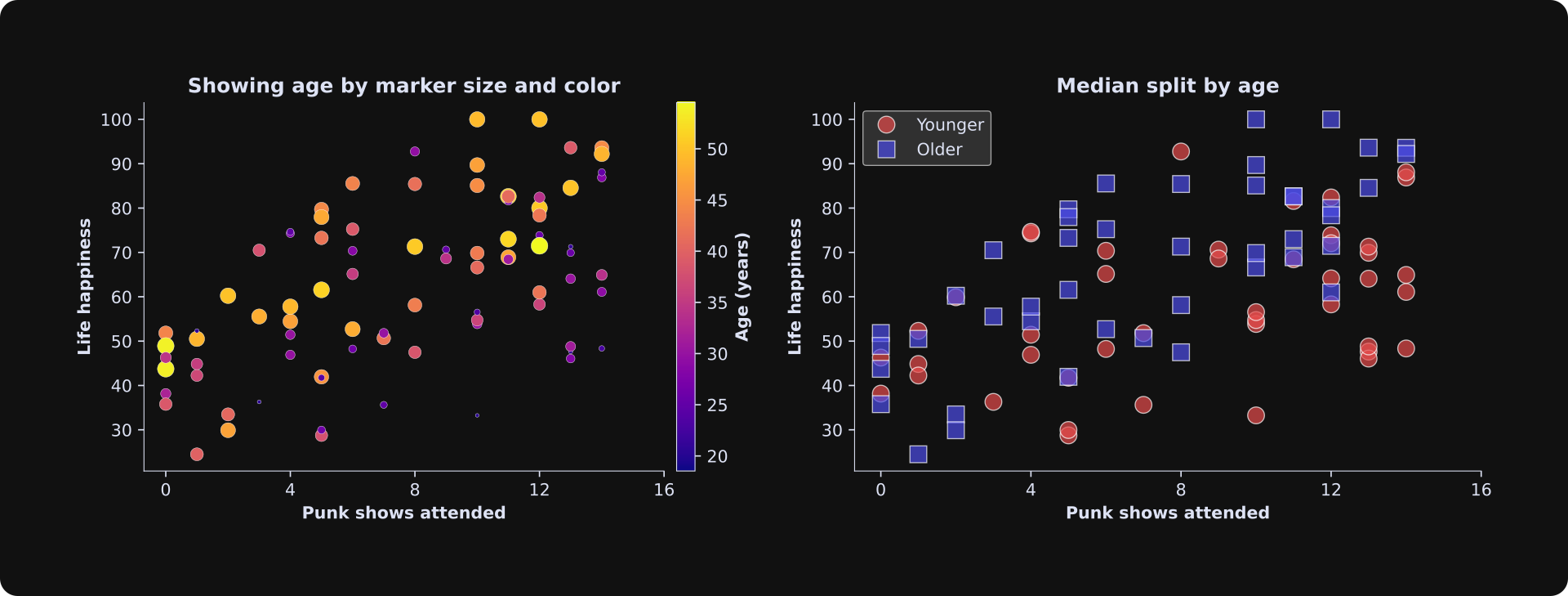
Left panel: Punk show count is on the x-axis and life happiness is on the y-axis. Age is represented both by the size of the marker (larger circles correspond to older people) and also by color (see colorbar). Technically, it is redundant to encode the same variable (age) using two dimensions (size and color), but I think it helps with the visualization. In practice, you might choose only one dimension.
Right panel: Here I split the dataset into two equal-sized groups according to the median age (median is the number that splits the dataset into two bins; in this case, it’s around 36), and made two scatter plot indicators for below- vs. above-median data values.
I showed two visualizations to give you some options; in practice, it’s best to pick one approach that gives the clearest visual interpretation in your dataset.
Now for the regression: Again, the code is nearly identical to that in the first simulation except for one additional variable in the design matrix. Here are the results:
           | Sim. | beta
-----------+------+------
 Intercept |  10  | 10.99
 PunkShows |   3  |  3.39
       Age | 0.8  |  0.70
As with the previous data simulation, the sample estimation here is pretty good, though not perfect. This is a very important observation: In real data, you don’t actually know what the ground-truth values are (if you did, you wouldn’t need to analyze data!); you just have to trust the results. Running simulations like this helps you build intuition for how far off the estimated parameters could be, even with sample sizes over 100. (Note: we could dive into this in more detail, for example, by calculating confidence intervals around the betas. I’ve discussed this in a different post.)
Next, I’ll create a set of visualizations like I did with the previous simulated dataset.
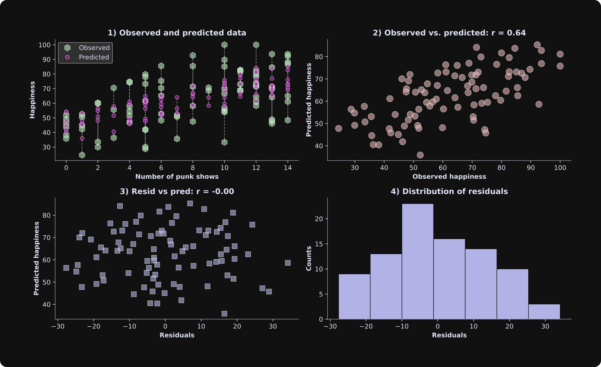
In the results figure from the previous simulation, the predicted data in panel 1 were a straight line, but here they look scattered. What’s the deal? Is there a bug somewhere??
Actually, both figures are correct. The difference is that with three variables, the model predictions form a line in a 3D space, but here they are projected down to two dimensions (note that the x-axis shows the number of punk shows, but the “age” axis is not shown). Each data point still has its own unique predicted value, but there are multiple observed and predicted values for each number of punk shows.
Running experiments with simulated data (sample size vs. adjusted-R2)
Here’s something I love about studying machine learning with simulated data: I can run experiments to learn nuances and intuition about statistical modeling (I’m a former neuroscientist and professor, so I’m a big fan of the scientific method of discovery).
Let’s run an experiment. The goal of the experiment will be to study the importance of sample size on the model fit to the data, using both R2 and adjusted R2. In a for-loop, we will generate new datasets using identical regression parameters and least-squares model-fitting, but different sample sizes and noise generations. After the experiment, we can visualize R2 and adjusted R2 as a function of sample size.
The code that runs the experiment is below. Please try to understand what the code does before reading my explanation below.
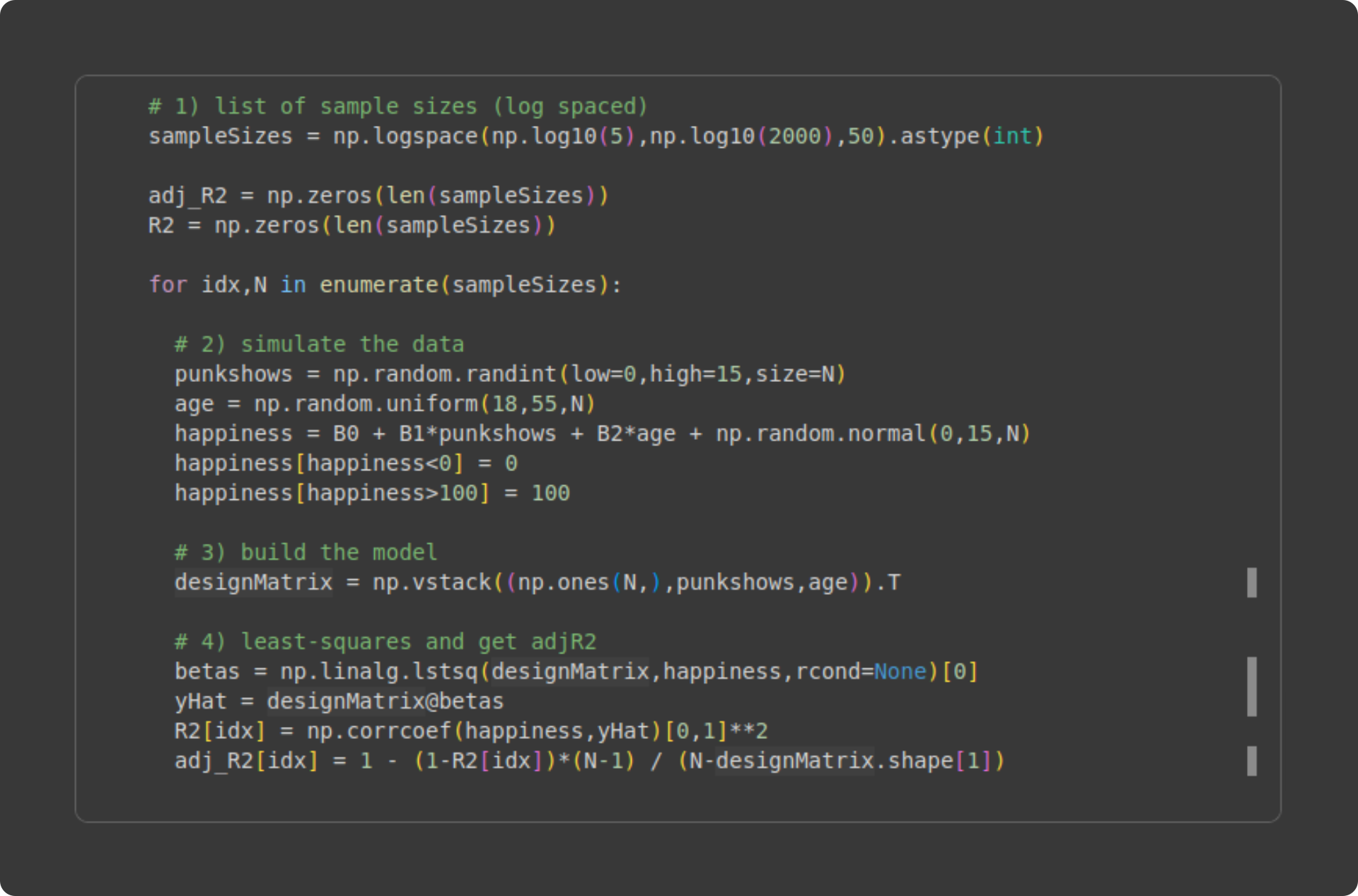
Initialize the range of sample sizes. I’m using 50 logarithmically spaced steps between N = 5 and N = 2000. Why logarithmically spaced instead of linearly spaced? The reason is that the impact of sample size is larger for smaller sample sizes — consider that doubling the sample size brings N = 5 to N = 10, but N = 1000 to N = 2000.
Inside the for-loop, I generate new data. I hope all this code looks familiar! It’s the same code you’ve seen before; the only difference is that the sample size (variable N) is defined in the for-loop definition from variable
sampleSizes).Build the design matrix. Again, you’ve seen this before.
Yet again, you’ve seen this code before 😏. The only new thing is putting the model fit results (R2 and adjusted R2) into vectors so we can visualize them.
The figure below shows the results.
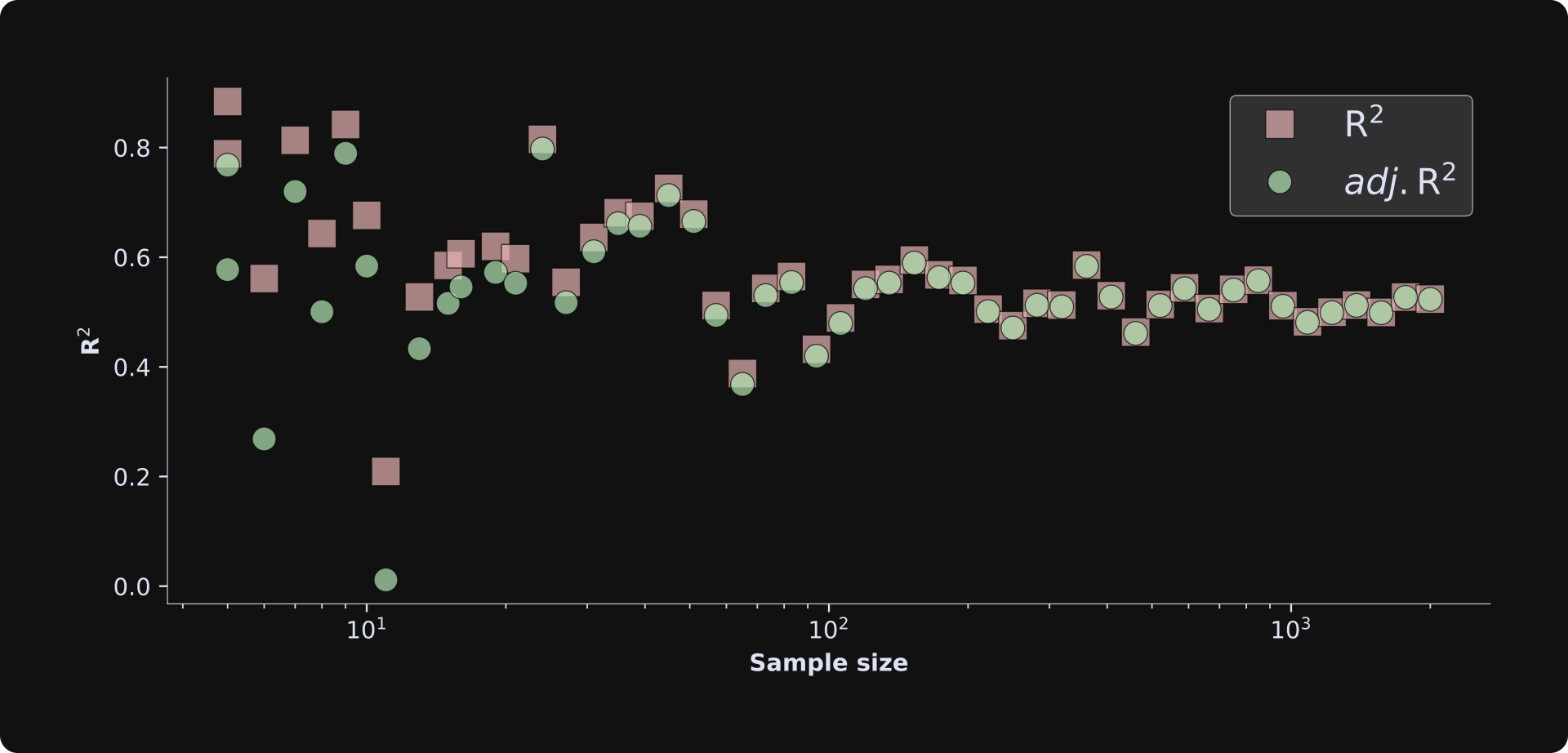
There are several important observations about this figure:
The R2 is consistently larger than the adjusted R2 (red squares above the green circles) for smaller sample sizes, but this discrepancy vanishes for larger sample sizes. This demonstrates that overfitting is less problematic as the sample size increases. If you’ve studied statistics, that conclusion isn’t surprising, but it’s great to see it emerge in a simulation. Mathematically, this happens because the degrees of freedom adjustment term (N-1)/(N-k) in the adjusted R2 formula converges to 1 as N increases and k doesn’t change.
The R2 terms fluctuate quite a bit for small sample sizes, and asymptotes to around .5 as the sample size increases. The convergence value of .5 has to do with the effect sizes and amount of noise — which you can manipulate in the code, e.g., by adjusting the standard deviation in np.random.normal(). The large fluctuations reflect random chance and sampling variability in small sample sizes. If you rerun the simulation and visualization code a few times, you’ll see that the small sample size iterations always have fluctuating R2 values.
If you feel inspired, please continue using my code as a springboard for more explorations and experiments. I love running simulation experiments and I could go on for hours… but I also respect your time, so I’ll call it a day here.
Get excited for Post 3!
After reading the previous and this posts, you are on your way to being a least-squares ninja 🥷
Post 3 in this series is full of adventure, mystique, and learning. You’ll learn how to import and process real data from the web, how to put the data into a pandas dataframe and use seaborn for data visualization, and how to use and interpret the OLS function (ordinary least-squares) in the statsmodels library.
The only bad thing about the next post is that I’ll stop talking about Hungarian punk music (my apologies to the punk fans).
I enjoy writing guest posts for The Palindrome, and if you’d like to learn even more from me, please consider subscribing to my Substack, taking my online video-based courses, and checking out my books.
 | A guest post by
|
Before I review your math, question: op ivy or rancid? No use for a name or blink? Is social D punk or rockabilly?